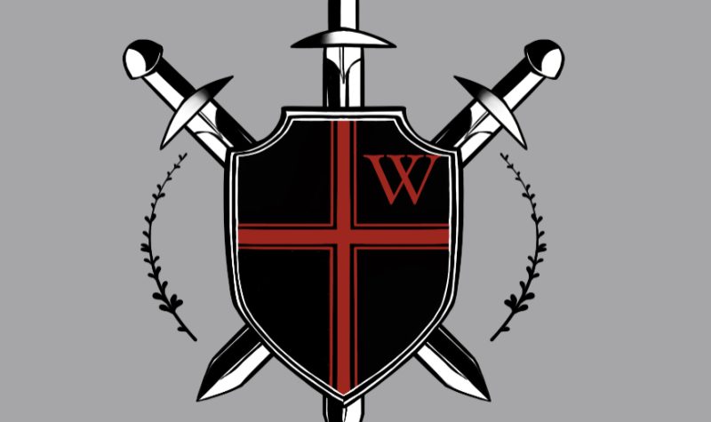
Liverpool Regional High School has a new logo to represent the Warriors.
The winning design features a shield with a small letter 'W' in the top right corner and three swords crossing behind from corner to corner and down the center.
Students were asked to vote last week for one of four final submissions and selected 15-year-old, Grade 10 student Autumn McDonald’s logo.
“It is pretty neat that my design is going to be used for a couple of years to come,” said McDonald.
Principal Souhail Soujah says he hopes the design will be in use for more than a couple of years.
Soujah says the idea of using a shield in the design is a great way of representing what it means to be a warrior.
“It fits right in with the ideology that a warrior is somebody who protects others, who stands up for the weak or for those who need protection,” said Soujah. “It works on many levels.”
The decision to replace the Warriors image of an Indigenous man wearing full traditional headdress was made by the students themselves late last year.
Many in the community spoke out against replacing an image that has been tied to the school for generations.
But current students felt using the image of someone from another culture in this way was inappropriate and no longer represented who they are.
This is not the first time McDonald’s art has been chosen to represent the school.
The cover of the Liverpool Regional High yearbook will feature another of her designs.
She is happy the students liked what she did enough to vote for her work. She says her friends have been very supportive.
“Some of them said they weren’t really surprised and others said they were very proud of me,” said McDonald.
She designed the image by first drawing a freehand sketch then using an app on her iPad to put together a polished submission.
McDonald has agreed to further refine her design to provide the school with a few options that can be used for a variety of applications.
Soujah says the SAC has set aside some money to get a copy of the new image into students’ hands in the next few weeks. He wouldn’t say how the logo will be delivered, only that it will be a surprise for all students.
Reported by Ed Halverson
E-mail: edhalversonnews@gmail.com
Twitter: @edwardhalverson
To listen to the broadcast of this story, press play below.


