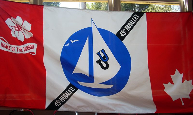
The Town of Ladysmith is looking at redesigning its “cacophony” of a flag.
That’s what Town Coun. Jeff Virtanen called the current town flag at the committee of the whole meeting on Tuesday night.
“I don't want to be too hard on our flag, but if there's a poster flag for redesigning, I think ours is it,” he said.
The town flag has a lot of elements, with a blue sailboat, two horseshoes, a diagonal line with the words “49th parallel,” a dogwood flower, and a maple leaf on a red and white Canadian flag-style background.
Mayor Aaron Stone says he likes the town’s flag, but sees value in updating it.
“I love the retro vibe. So I have some affinity for it, I'm not going to lie. I think it's cool because it says a lot to me. I grew up here right so when I think of home of the dogwood, I think of Dogwood Days. Sometimes I mistakenly refer to Ladysmith Days as Dogwood Days. But I also recognize that progress doesn't ever delete the past, the historical context and the iconography.”
Mayor Stone mentioned CBC’s municipal affairs reporter Justin McElroy, who ranked 130 BC municipalities’ flags on Twitter in 2018.
“The ranking of Ladysmith’s flag was very low. Near the bottom of the provincial rankings for municipal flags,” he said.
However, McElroy never ranked Ladysmith’s flag at the time.
“The reason I didn't rank it was because I use the Flags of the World website as a reference and they had like 130 flags out there. And I was like, ‘Oh, that's pretty full' and I didn't cross-reference with municipalities that didn't have a flag and asked whether they did because there's something so many hours in the day.”
McElroy says Ladysmith’s flag looks like it was designed by committee.
“It's a bit of a hot mess,” he said. “You can really tell it's the sort of thing that a bunch of people had different suggestions for and they jammed it all onto one thing.”
If he were to rank Ladysmith’s flag, McElroy would put it about the middle of the pack for BC municipalities.
“I would probably rank it somewhere in the 70s or 80s because they're trying things,” he said. “There's three colors and they follow some of the rules, but I can't give it any more than that just because it's so busy.
Dean McGee is an expert on municipal flags in British Columbia who worked as a researcher for a book on the subject by the North American Vexillological Association.
He agrees the Ladysmith flag could use a refresh, but also worries about losing the character of the current flag.
“It could use a redesign, the fear is that, just like so many other cities, they'll just take a plain white flag and put the letterhead on it, and put the city name in giant letters,” he said. “Those always look ugly.”
McElroy agrees that Ladysmith’s flag has character and is better than what he calls logo-on-a-bedsheet flags.
“It's homespun in a way that is sort of cute and quirky, and it's definitely unique, he said. “It's better than something that's very corporate and brandy. But at the same time, it is not in any technical sense of the word, good.”
McGee thinks the Ladysmith town council’s plan to refer the discussion to the town’s public art commitee is a good approach and suggests that a contest for local school children could be another way to get some ideas.
“Sometimes when a city lets school kids do a competition, they kind of need to take the artwork and maybe tweak it a little before it actually gets flown on a flag,” he said. “But people can come up with a good logo that will fit on a flag.”
Coun. Marsh Stevens says redesigning the town flag is something that matters.
“I think this is really exciting. I think symbols matter,” he said at Tuesday’s meeting. “Flags matter a little [too] much to certain folks. But I think a clear, modern symbol of the town is not a frivolous thing. It's an important thing and it's not a lot of effort, and it's not a lot of money.”
Mayor Stone says that he is looking forward to the conversations about a new flag in the Ladysmith community and encourages people to contact him if they have ideas about it.
“There's no derision toward our flag, other than those of Justin McElroy when he ranked it, but there's no set viewpoints,” he said. “It's just time for a conversation on how we move forward and represent our flag in our community in the best way.”
Listen to CHLY's story below:


